为了兼容老用户,旧的标签插件在重构之前依然沿用旧的格式,即 command + 空格 作为参数分隔符,而部分新增标签插件是 空格 + 英文竖线 + 空格 ,请注意区分。
我们也在探索哪种分隔符既简单又不容易引起冲突,所以可能存在多种格式,具体以对应文档描述为准。
5.0 版本起临时实验使用英文双冒号 ( :: ) 作为分隔符,之前版本的分隔符写法向下兼容
6.0 版本的分隔符最终计划使用 stellar 的分隔符,之前版本的分隔符写法没有兼容计划
text 带 下划线 的文本;带着重号 的文本;带波浪线 的文本;带 删除线 的文本
键盘样式的文本:⌘ + D
密码样式的文本:这里没有验证码
带 {% u 下划线 %} 的文本;带 {% emp 着重号 %} 的文本;带 {% wavy 波浪线 %} 的文本;带 {% del 删除线 %} 的文本

键盘样式的文本:{% kbd ⌘ %} + {% kbd D %}

密码样式的文本:{% psw 这里没有验证码 %}
span 各种颜色的标签,包括:红色 、黄色 、绿色 、青色 、蓝色 、灰色 。
超大号文字:
Volantis A Wonderful Theme for Hexo
各种颜色的标签,包括:{% span red::红色 %}、{% span yellow::黄色 %}、{% span green::绿色 %}、{% span cyan::青色 %}、{% span blue::蓝色 %}、{% span gray::灰色 %}。

超大号文字:

{% span center logo large::Volantis %} {% span center small::A Wonderful Theme for Hexo %}
属性 可选值 字体 logo, code颜色 red, yellow, green, cyan, blue, gray大小 small, h4, h3, h2, h1, large, huge, ultra对齐方向 left, center, right
p 红色
黄色
绿色
青色
蓝色
灰色
Volantis
A Wonderful Theme for Hexo
{% p red::红色 %}
{% p yellow::黄色 %}
{% p green::绿色 %}
{% p cyan::青色 %}
{% p blue::蓝色 %}
{% p gray::灰色 %}

{% p center logo large::Volantis %}
{% p center small::A Wonderful Theme for Hexo %}
属性 可选值 字体 logo, code颜色 red, yellow, green, cyan, blue, gray大小 small, h4, h3, h2, h1, large, huge, ultra对齐方向 left, center, right
note NoteBlock 是 Blockquote 的增强版,在左边显示图标,并且可以自定颜色。而 Note 是 NoteBlock 的简便写法。
最后更新于 5.0 版本 演示效果 经典用法 可以在配置文件中设置默认样式,为简单的一句话提供最的简便写法。
note warning 默认黄色,适合警告性的信息
note error/danger 默认红色,适合危险性的信息
note done/success 默认绿色,适合正确操作的信息
更多图标 这些都是默认样式,可以手动加上颜色:
note radiation yellow 可以加上颜色
note paperclip blue 放置一些附件链接
note guide clear 可以加上一段向导
note undo light 可以说明如何撤销或者回退
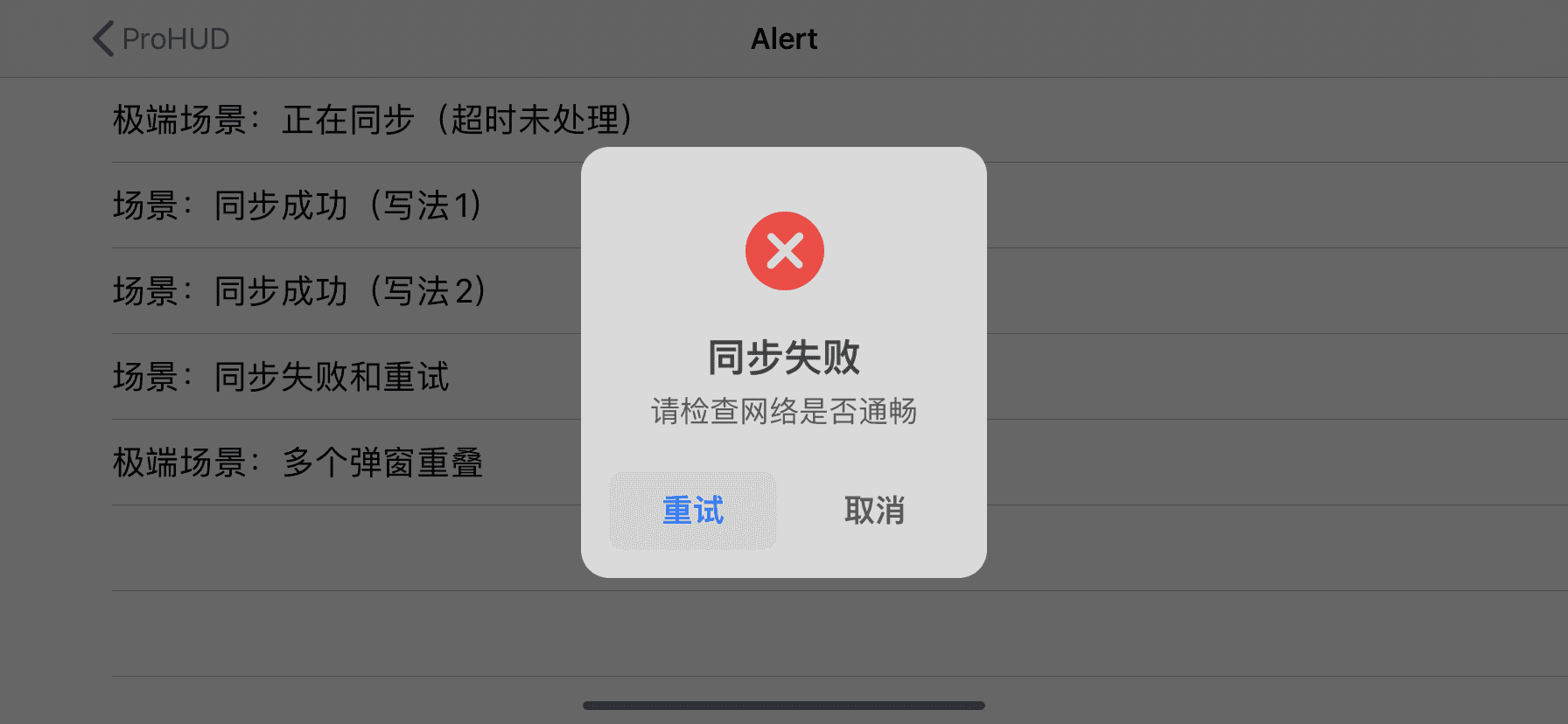
上述示例的源码 example: #### 经典用法 {% note::可以在配置文件中设置默认样式,为简单的一句话提供最的简便写法。 %} {% note quote::note quote 适合引用一段话 %} {% note info::note info 默认主题色,适合中性的信息 %} {% note warning::note warning 默认黄色,适合警告性的信息 %} {% note danger::note error/danger 默认红色,适合危险性的信息 %} {% note success::note done/success 默认绿色,适合正确操作的信息 %} #### 更多图标 这些都是默认样式,可以手动加上颜色: {% note radiation::note radiation 默认样式 %} {% note radiation yellow::note radiation yellow 可以加上颜色 %} {% note bug red::note bug red 说明还存在的一些故障 %} {% note link green::note link green 可以放置一些链接 %} {% note paperclip blue::note paperclip blue 放置一些附件链接 %} {% note todo::note todo 待办事项 %} {% note guide clear::note guide clear 可以加上一段向导 %} {% note download::note download 可以放置下载链接 %} {% note message gray::note message gray 一段消息 %} {% note up::note up 可以说明如何进行更新 %} {% note undo light::note undo light 可以说明如何撤销或者回退 %}
可以支持的参数 样式参数位置可以写图标和颜色,多个样式参数用空格隔开。
图标 彩色的 quote, info, warning, done/success, error/danger
灰色的,也可以指定颜色 radiation, bug, idea, link, paperclip, todo, message, guide, download, up, undo
颜色 指定颜色 clear, light, gray, red, yellow, green, cyan, blue
noteblock NoteBlock 是 Blockquote 的增强版,在左边显示图标,并且可以自定颜色。而 Note 是 NoteBlock 的简便写法。
最后更新于 5.0 版本 {% noteblock 样式参数(可选)::标题(可选) %} 文本段落 {% endnoteblock %}
演示效果 可以在区块中放置一些复杂的结构,支持嵌套。
标题(可选)
Windows 10不是為所有人設計,而是為每個人設計
Folding 测试: 点击查看更多 上述示例的源码 example: {% noteblock::标题(可选) %} Windows 10不是為所有人設計,而是為每個人設計 {% noteblock done %} 嵌套测试: 请坐和放宽,我正在帮你搞定一切... {% endnoteblock %} {% folding yellow::Folding 测试: 点击查看更多 %} {% note warning::不要说我们没有警告过你 %} {% noteblock bug red %} 我们都有不顺利的时候 {% endnoteblock %} {% endfolding %} {% endnoteblock %}
可以支持的参数 样式参数位置可以写图标和颜色,多个样式参数用空格隔开。
图标 彩色的 quote, info, warning, done/success, error/danger
灰色的,也可以指定颜色 radiation, bug, idea, link, paperclip, todo, message, guide, download, up, undo
颜色 指定颜色 clear, light, gray, red, yellow, green, cyan, blue
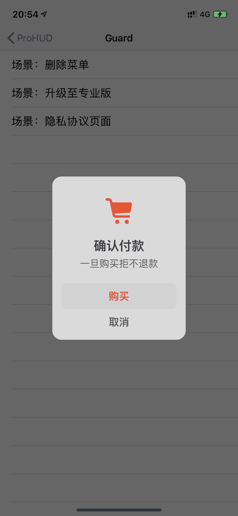
checkbox 最后更新于 5.0 版本 {% checkbox 样式参数(可选)::文本(支持简单md) %}
演示效果 上述示例的源码 example: {% checkbox 纯文本测试 %} {% checkbox checked::支持简单的 [markdown ](https://guides.github.com/features/mastering-markdown/ ) 语法 %} {% checkbox red::支持自定义颜色 %} {% checkbox green checked::绿色 + 默认选中 %} {% checkbox yellow checked::黄色 + 默认选中 %} {% checkbox cyan checked::青色 + 默认选中 %} {% checkbox blue checked::蓝色 + 默认选中 %} {% checkbox plus green checked::增加 %} {% checkbox minus yellow checked::减少 %} {% checkbox times red checked::叉 %}
可以支持的参数 颜色 red, yellow, green, cyan, blue
样式 选中状态 radio 最后更新于 5.0 版本 {% checkbox 样式参数(可选)::文本(支持简单md) %}
演示效果 上述示例的源码 example: {% radio 纯文本测试 %} {% radio checked::支持简单的 [markdown ](https://guides.github.com/features/mastering-markdown/ ) 语法 %} {% radio red::支持自定义颜色 %} {% radio green::绿色 %} {% radio yellow::黄色 %} {% radio cyan::青色 %} {% radio blue::蓝色 %}
可以支持的参数 颜色 red, yellow, green, cyan, blue
选中状态 timeline 最后更新于 3.0 版本 {% timeline 时间线标题(可选) %} {% timenode 时间节点(标题) %} 正文内容 {% endtimenode %} {% timenode 时间节点(标题) %} 正文内容 {% endtimenode %} {% endtimeline %}
演示效果 如果有 hexo-lazyload-image 插件,需要删除并重新安装最新版本,设置 lazyload.isSPA: true。 2.x 版本的 css 和 js 不适用于 3.x 版本,如果使用了 use_cdn: true 则需要删除。 2.x 版本的 fancybox 标签在 3.x 版本中被重命名为 gallery 。 2.x 版本的置顶 top: true 改为了 pin: true,并且同样适用于 layout: page 的页面。 如果使用了 hexo-offline 插件,建议卸载,3.0 版本默认开启了 pjax 服务。 全局搜索 seotitle 并替换为 seo_title。 group 组件的索引规则有变,使用 group 组件的文章内,group: group_name 对应的组件名必须是 group_name。 group 组件的列表名优先显示文章的 short_title 其次是 title。 上述示例的源码 example: {% timeline %} {% timenode 2020-07-24 [2.6.6 -> 3.0 ](https://github.com/volantis-x/hexo-theme-volantis/releases ) %} 1. 如果有 `hexo-lazyload-image` 插件,需要删除并重新安装最新版本,设置 `lazyload.isSPA: true` 。2. 2.x 版本的 css 和 js 不适用于 3.x 版本,如果使用了 `use_cdn: true` 则需要删除。3. 2.x 版本的 fancybox 标签在 3.x 版本中被重命名为 gallery 。4. 2.x 版本的置顶 `top: true` 改为了 `pin: true` ,并且同样适用于 `layout: page` 的页面。5. 如果使用了 `hexo-offline` 插件,建议卸载,3.0 版本默认开启了 pjax 服务。{% endtimenode %} {% timenode 2020-05-15 [2.6.3 -> 2.6.6 ](https://github.com/volantis-x/hexo-theme-volantis/releases/tag/2.6.6 ) %} 不需要额外处理。 {% endtimenode %} {% timenode 2020-04-20 [2.6.2 -> 2.6.3 ](https://github.com/volantis-x/hexo-theme-volantis/releases/tag/2.6.3 ) %} 1. 全局搜索 `seotitle` 并替换为 `seo_title` 。2. group 组件的索引规则有变,使用 group 组件的文章内,`group: group_name` 对应的组件名必须是 `group_name` 。2. group 组件的列表名优先显示文章的 `short_title` 其次是 `title` 。{% endtimenode %} {% endtimeline %}
link 最后更新于 5.0 版本 {% link 标题::链接::图片链接(可选) %}
演示效果 上述示例的源码 example: {% link 如何参与项目::https://volantis.js.org/contributors/::https://gcore.jsdelivr.net/gh/xaoxuu/cdn-assets@master/logo/256/safari.png %}
基础按钮 请将您的 Volantis 升级至 2.4 版本以上使用。
{% btn 样式参数(可选)::标题::链接::图标(可选) %}
样式参数
图标
第1个或者第2个参数包含 fa- 的那个被识别为图标。
example.md: 不设置任何参数的 {% btn 按钮:: / %} 适合融入段落中。 regular 按钮适合独立于段落之外: {% btn regular::示例博客::https://xaoxuu.com::fas fa-play-circle %} large 按钮更具有强调作用,建议搭配 center 使用: {% btn center large::开始使用::https://volantis.js.org/v3/getting-started/::fas fa-download %}
富文本按钮 请将您的 Volantis 升级至 2.3 版本以上使用。
{% btns 样式参数 %}
{% cell 标题::链接::图片或者图标 %}
{% cell 标题::链接::图片或者图标 %}
{% endbtns %}
样式参数位置可以写图片样式、布局方式,多个样式参数用空格隔开。
圆角样式
默认为方形
布局方式
默认为自动宽度,适合视野内只有一两个的情况。
参数 含义 wide 宽一点的按钮 fill 填充布局,自动铺满至少一行,多了会换行。 center 居中,按钮之间是固定间距。 around 居中分散 grid2 等宽最多2列,屏幕变窄会适当减少列数。 grid3 等宽最多3列,屏幕变窄会适当减少列数。 grid4 等宽最多4列,屏幕变窄会适当减少列数。 grid5 等宽最多5列,屏幕变窄会适当减少列数。
增加文字样式
可以在容器内增加 <b>标题</b> 和 <p>描述文字</p>
如果需要显示类似「团队成员」之类的一组含有头像的链接:
example.md: {% btns circle grid5 %} {% cell xaoxuu::https://xaoxuu.com::https://gcore.jsdelivr.net/gh/xaoxuu/cdn-assets/avatar/avatar.png %} {% cell xaoxuu::https://xaoxuu.com::https://gcore.jsdelivr.net/gh/xaoxuu/cdn-assets/avatar/avatar.png %} {% cell xaoxuu::https://xaoxuu.com::https://gcore.jsdelivr.net/gh/xaoxuu/cdn-assets/avatar/avatar.png %} {% cell xaoxuu::https://xaoxuu.com::https://gcore.jsdelivr.net/gh/xaoxuu/cdn-assets/avatar/avatar.png %} {% cell xaoxuu::https://xaoxuu.com::https://gcore.jsdelivr.net/gh/xaoxuu/cdn-assets/avatar/avatar.png %} {% endbtns %}
或者含有图标的按钮:
example.md: {% btns rounded grid5 %} {% cell 下载源码::/::fas fa-download %} {% cell 查看文档::/::fas fa-book-open %} {% endbtns %}
圆形图标 + 标题 + 描述 + 图片 + 网格5列 + 居中
example.md: {% btns circle center grid5 %} <a href ='https://apps.apple.com/cn/app/heart-mate-pro-hrm-utility/id1463348922?ls=1' > <i class ='fab fa-apple' > </i > <b > </b > {% p red::专业版 %} <img src ='https://gcore.jsdelivr.net/gh/xaoxuu/cdn-assets/qrcode/heartmate_pro.png' > </a > <a href ='https://apps.apple.com/cn/app/heart-mate-lite-hrm-utility/id1475747930?ls=1' > <i class ='fab fa-apple' > </i > <b > </b > {% p green::免费版 %} <img src ='https://gcore.jsdelivr.net/gh/xaoxuu/cdn-assets/qrcode/heartmate_lite.png' > </a > {% endbtns %}
如果需要显示类似「团队成员」之类的一组含有头像的链接:
或者含有图标的按钮:
圆形图标 + 标题 + 描述 + 图片 + 网格5列 + 居中
ghcard 最后更新于 5.0 版本 {% ghcard 用户名::其它参数(可选) %} {% ghcard 用户名/仓库::其它参数(可选) %}
用户信息卡片 上述示例的源码:
example: | {% ghcard xaoxuu %} | {% ghcard xaoxuu::theme=vue %} | | -- | -- | | {% ghcard xaoxuu::theme=buefy %} | {% ghcard xaoxuu::theme=solarized-light %} | | {% ghcard xaoxuu::theme=onedark %} | {% ghcard xaoxuu::theme=solarized-dark %} | | {% ghcard xaoxuu::theme=algolia %} | {% ghcard xaoxuu::theme=calm %} |
仓库信息卡片 上述示例的源码:
example: | {% ghcard volantis-x/hexo-theme-volantis %} | {% ghcard volantis-x/hexo-theme-volantis::theme=vue %} | | -- | -- | | {% ghcard volantis-x/hexo-theme-volantis::theme=buefy %} | {% ghcard volantis-x/hexo-theme-volantis::theme=solarized-light %} | | {% ghcard volantis-x/hexo-theme-volantis::theme=onedark %} | {% ghcard volantis-x/hexo-theme-volantis::theme=solarized-dark %} | | {% ghcard volantis-x/hexo-theme-volantis::theme=algolia %} | {% ghcard volantis-x/hexo-theme-volantis::theme=calm %} |
更多参数选择 site 网站卡片可以显示网站截图、logo、标题、描述,使用方法和 友链标签 一模一样,唯一的区别是数据文件名称为 sites.yml,可以和友链数据混用,通过分组过滤实现不一样的效果。
最后更新于 5.0 版本 演示效果 上述示例的源码 example {% sites only:community_team %}
可以支持的参数 数据按组筛选 支持分组(白名单模式和黑名单模式)显示:
// 显示 communtiy_team
{% sites only:communtiy_team %}

// 除了 communtiy_team 别的都显示
{% sites not:community_team %}

// 多个分组使用 `,` 分隔
{% sites only:communtiy_team, communtiy_builder %}
下拉菜单 请将您的 Volantis 升级至 3.0 版本以上使用。
tab 此插件移植自 NexT #tabs
最后更新于 2.1 版本 {% tabs 页面内不重复的ID %} <!-- tab 栏目1 --> 内容 <!-- endtab --> <!-- tab 栏目2 --> 内容 <!-- endtab --> {% endtabs %}
演示效果 上述示例的源码 example: {% tabs tab-id %} <!-- tab 栏目1 --> 。。。 <!-- endtab --> <!-- tab 栏目2 --> !!! <!-- endtab --> {% endtabs %}
folding 最后更新于 5.0 版本 {% folding 参数(可选)::标题 %}  {% endfolding %}
演示效果 查看图片测试 查看默认打开的折叠框 查看代码测试 {% folding green::查看代码测试 %} 查看代码测试 {% endfolding %}
查看列表测试 查看嵌套测试 查看嵌套测试2 查看嵌套测试3 hahaha
上述示例的源码 example: {% folding 查看图片测试 %}  {% endfolding %} {% folding cyan open::查看默认打开的折叠框 %} 这是一个默认打开的折叠框。 {% endfolding %} {% folding green::查看代码测试 %} {% endfolding %} {% folding yellow::查看列表测试 %} - haha- hehe{% endfolding %} {% folding red::查看嵌套测试 %} {% folding blue::查看嵌套测试2 %} {% folding 查看嵌套测试3 %} hahaha <span > <img src ='https://gcore.jsdelivr.net/gh/volantis-x/cdn-emoji/tieba/%E6%BB%91%E7%A8%BD.png' style ='height:24px' > </span > {% endfolding %} {% endfolding %} {% endfolding %}
可以支持的参数 参数位置可以填写颜色和状态,多个参数用空格隔开。
颜色 blue, cyan, green, yellow, red
状态 状态填写 open 代表默认打开。
inlineimage Inlineimage 标签是一种行内图片标签,可以用来在一段话中间插入表情。
本插件最后更新于 5.0 版本 {% inlineimage 图片链接::height=高度(可选) %}
演示效果 这是
这又是
上述示例的源码 example: 这是 {% inlineimage https://gcore.jsdelivr.net/gh/volantis-x/cdn-emoji/aru-l/0000.gif %} 一段话。 这又是 {% inlineimage https://gcore.jsdelivr.net/gh/volantis-x/cdn-emoji/aru-l/5150.gif::height=40px %} 一段话。
可以支持的参数 高度 image Image 标签是一种针对单个图片应用场景的标签,支持图片描述文字和指定宽度。
本插件最后更新于 5.0 版本 {% image 链接::width=宽度(可选)::height=高度(可选)::alt=描述(可选)::bg=占位颜色(可选) %}
演示效果 添加描述:
指定宽度:
指定宽度并添加描述:
设置占位背景色:
上述示例的源码 example: 添加描述: {% image https://gcore.jsdelivr.net/gh/volantis-x/cdn-wallpaper-minimalist/2020/025.jpg::alt=每天下课回宿舍的路,没有什么故事。 %} 指定宽度: {% image https://gcore.jsdelivr.net/gh/volantis-x/cdn-wallpaper-minimalist/2020/025.jpg::width=400px %} 指定宽度并添加描述: {% image https://gcore.jsdelivr.net/gh/volantis-x/cdn-wallpaper-minimalist/2020/025.jpg::width=400px::alt=每天下课回宿舍的路,没有什么故事。 %} 设置占位背景色: {% image https://gcore.jsdelivr.net/gh/volantis-x/cdn-wallpaper-minimalist/2020/025.jpg::width=400px::bg=#1D0C04::alt=优化不同宽度浏览的观感 %}
可以支持的参数 图片宽高度 example: 图片描述 example: 占位背景色 example: gallery Gallery 标签是一种针对一组图片应用场景的标签。
本插件最后更新于 5.0 版本 {% gallery 参数::列数::分组 %}   {% endgallery %}
演示效果 一行一个图片
图片描述 一行多个图片(不换行)
多行多个图片(每行2~8个图片)
上述示例的源码 一行一个图片
example.md: {% gallery %}  {% endgallery %}
一行多个图片(不换行)
example.md: {% gallery::::one %}    {% endgallery %}
多行多个图片(每行2~8个图片)
example.md: {% gallery stretch::6::two %}                         {% endgallery %}
可以支持的参数 对齐方向 缩放 列数 ::后面直接写列数,支持 2 ~ 8 列。设定列数之后就是「多行多图」布局,此时图片默认左对齐。为了避免图片大小不一,建议搭配 stretch 来时图片放大填充。
测试中 设定列数之后 不会产生 累积布局偏移; 没有设定列数 产生了累积布局偏移
分组 相同内容的会被归档在一个分组中。
audio 本插件最后更新于 2.4 版本 演示效果 Your browser does not support the audio tag. 上述示例的源码 example: {% audio https://github.com/volantis-x/volantis-docs/releases/download/assets/Lumia1020.mp3 %}
video 本插件最后更新于 5.0 版本 演示效果 100%宽度
Your browser does not support the video tag.
50%宽度
Your browser does not support the video tag.
Your browser does not support the video tag.
Your browser does not support the video tag.
Your browser does not support the video tag.
25%宽度
Your browser does not support the video tag.
Your browser does not support the video tag.
Your browser does not support the video tag.
Your browser does not support the video tag.
Your browser does not support the video tag.
Your browser does not support the video tag.
Your browser does not support the video tag.
Your browser does not support the video tag.
上述示例的源码 100%宽度
example.md: {% video https://github.com/volantis-x/volantis-docs/releases/download/assets/IMG_0341.mov %}
50%宽度
example.md: {% videos::2 %} {% video https://github.com/volantis-x/volantis-docs/releases/download/assets/IMG_0341.mov %} {% video https://github.com/volantis-x/volantis-docs/releases/download/assets/IMG_ 0341.mov %}{% video https://github.com/volantis-x/volantis-docs/releases/download/assets/IMG_0341.mov %} {% video https://github.com/volantis-x/volantis-docs/releases/download/assets/IMG_ 0341.mov %}{% endvideos %}
25%宽度
example.md: {% videos::4 %} {% video https://github.com/volantis-x/volantis-docs/releases/download/assets/IMG_0341.mov %} {% video https://github.com/volantis-x/volantis-docs/releases/download/assets/IMG_ 0341.mov %}{% video https://github.com/volantis-x/volantis-docs/releases/download/assets/IMG_0341.mov %} {% video https://github.com/volantis-x/volantis-docs/releases/download/assets/IMG_ 0341.mov %}{% video https://github.com/volantis-x/volantis-docs/releases/download/assets/IMG_0341.mov %} {% video https://github.com/volantis-x/volantis-docs/releases/download/assets/IMG_ 0341.mov %}{% video https://github.com/volantis-x/volantis-docs/releases/download/assets/IMG_0341.mov %} {% video https://github.com/volantis-x/volantis-docs/releases/download/assets/IMG_ 0341.mov %}{% endvideos %}
可以支持的参数 对齐方向 列数 ::后面直接写列数,支持 1 ~ 4 列。
frame 这是一个能够将图片或者视频套入设备框架中的标签,可以用来更优雅地显示截图、录屏。
本插件最后更新于 5.0 版本 {% frame 框架名::img=图片链接::alt=图片描述(可选)::part=top/bottom(可选) %} {% frame 框架名::video=视频链接::part=top/bottom(可选) %}
{% frame iphone11::img=https://bu.dusays.com/2020/09/28/baa33914a34ec.jpg::video=https://bu.dusays.com/2020/09/28/39db723f1e200.mp4::part=top %}
在这个示例中同时出现了 img 和 video 那么它就是一个带有封面的视频,在视频加载完成之前会先显示视频封面。
设备框架 目前支持的有:
如果您有以下其它设备框架图(svg),欢迎 PR 兼容。
android, ipad, macbook, watch
剪裁 通过设置 part=top 或者 part=bottom 来显示上半部分或者下半部分,否则将显示完整的框架及其中的图片/视频。
aplayer 主题对 APlayer 插件的样式进行了兼容。安装插件:
npm i -S hexo-tag-aplayer
使用方法:
issues issues 标签在5.0版本移除 被 sites标签 friends标签 contributors标签 替代
md 在局部渲染外部md文件。
示例写法 {% md https://gcore.jsdelivr.net/gh/volantis-x/hexo-theme-volantis/README.md %}
md swiper 轮播标签 默认一张图片是 50% 宽度,通过设置 width:min 设置为 25% 宽度,width:max 设置为 100% 宽度。
最大图片宽度 {% swiper width:max %}  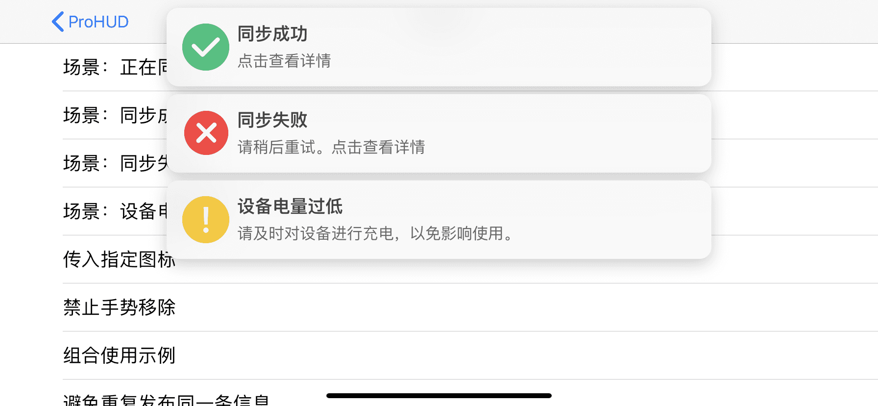  {% endswiper %}
最小图片宽度 {% swiper width:min %} 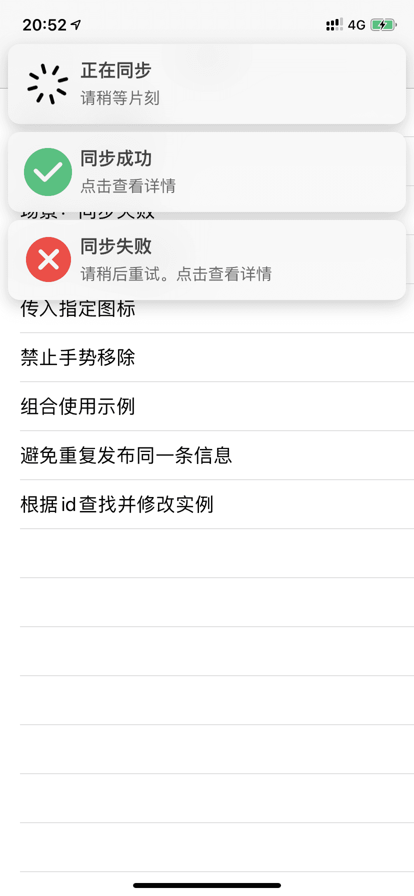 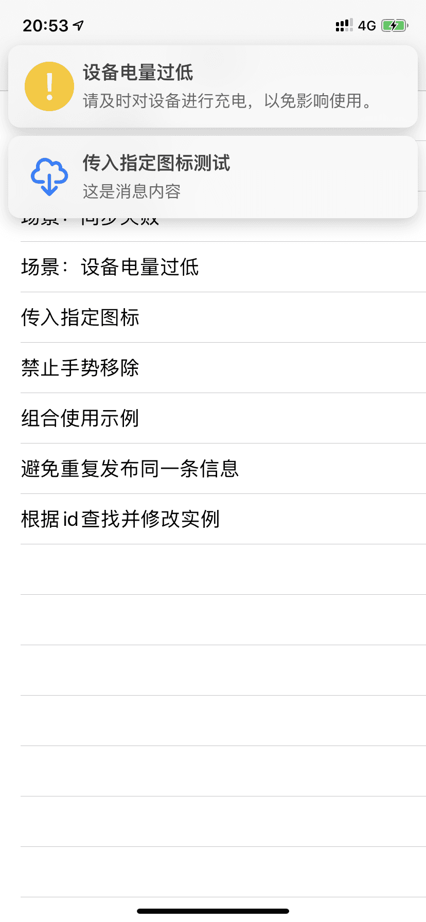  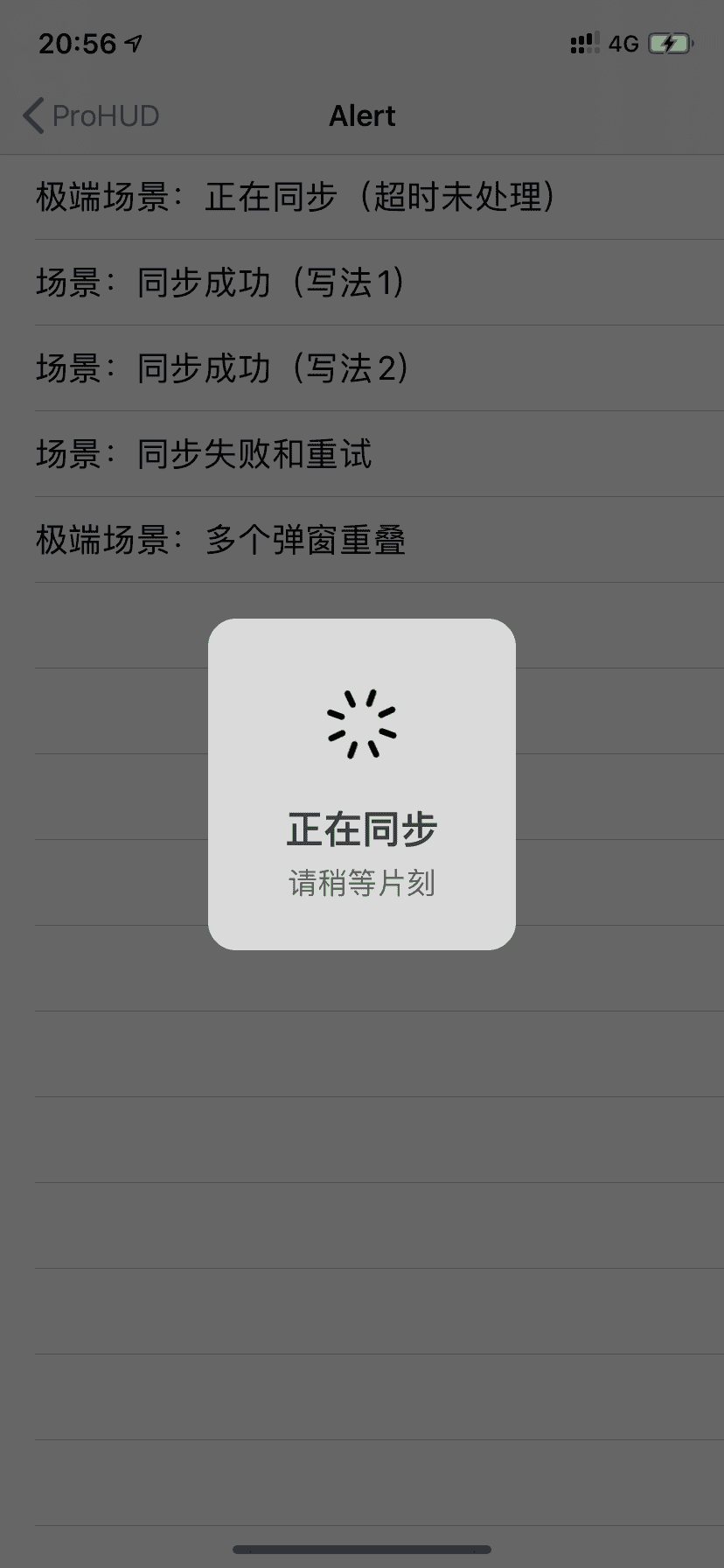  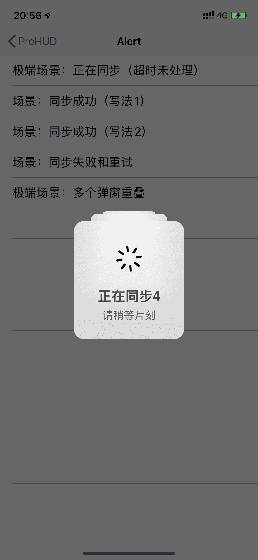     {% endswiper %}
pandown 本插件最后更新于 5.0 版本 {% pandown 网盘类型::网盘链接::提取码(可为空)::文件名 %}
演示效果 上述示例的源码 example: {% pandown baidu::https://example.com::1234::百度网盘 %} {% pandown tx::https://example.com::1234::腾讯微云 %} {% pandown onedrive::https://example.com::1234::onedrive %} {% pandown hc::https://example.com::1234::和彩云 %} {% pandown ty::https://example.com::1234::天翼云 %} {% pandown aliyun::https://example.com::1234::阿里网盘 %} {% pandown 115::https://example.com::1234::115网盘 %} {% pandown jg::https://example.com::1234::坚果云 %} {% pandown 360::https://example.com::1234::360安全云盘 %} {% pandown 123::https://example.com::1234::123网盘 %} {% pandown qn::https://example.com::1234::七牛云 %} {% pandown github::https://example.com::::Github %} {% pandown lz::https://example.com::1234::蓝奏云 %}
可以支持的参数 网盘类型 baidu, tx, onedrive, hc, ty, aliyun, 115, jg, 360, 123, qn, github, lz
如果里的主题版本不支持或有问题可查看如下文档
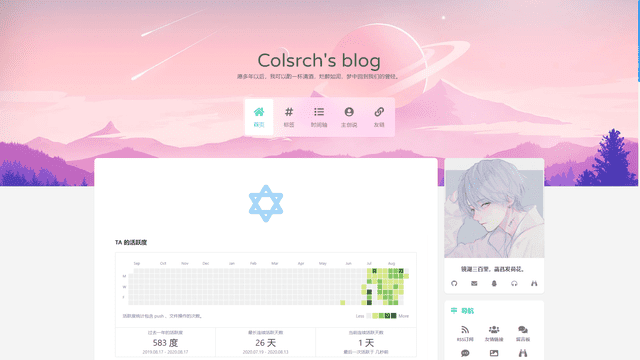
友链标签 您可以在任何位置插入友链,支持静态数据和动态数据,静态数据需要写在数据文件中:
blog/source/_data/friends.yml volantis_developer: title: description: items: - title: xaoxuu url: https://github.com/xaoxuu avatar: https://avatars.githubusercontent.com/u/16400144?s=60&v=4 - title: MHuiG url: https://github.com/MHuiG avatar: https://avatars.githubusercontent.com/u/38281581?s=60&v=4 - title: inkss url: https://github.com/inkss avatar: https://avatars.githubusercontent.com/u/31947043?s=60&v=4 - title: Colsrch url: https://github.com/Colsrch avatar: https://avatars.githubusercontent.com/u/58458181?s=60&v=4 - title: Drew233 url: https://github.com/Drew233 avatar: https://avatars.githubusercontent.com/u/47592224?s=60&v=4 - title: Linhk1606 url: https://github.com/Linhk1606 avatar: https://avatars.githubusercontent.com/u/50829219?s=60&v=4 - title: W4J1e url: https://github.com/W4J1e avatar: https://avatars.githubusercontent.com/u/74824162?s=60&v=4 community_builder: title: description: items: - title: xaoxuu url: https://github.com/xaoxuu avatar: https://avatars.githubusercontent.com/u/16400144?s=60&v=4 - title: MHuiG url: https://github.com/MHuiG avatar: https://avatars.githubusercontent.com/u/38281581?s=60&v=4 - title: Colsrch url: https://github.com/Colsrch avatar: https://avatars.githubusercontent.com/u/58458181?s=60&v=4 - title: penndu url: https://github.com/penndu avatar: https://avatars.githubusercontent.com/u/46226528?s=60&v=4 - title: heson525 url: https://github.com/heson525 avatar: https://avatars.githubusercontent.com/u/32234343?s=60&v=4 - title: W4J1e url: https://github.com/W4J1e avatar: https://avatars.githubusercontent.com/u/74824162?s=60&v=4 - title: luosiwei-cmd url: https://github.com/luosiwei-cmd avatar: https://avatars.githubusercontent.com/u/61175380?s=60&v=4
标题和描述都支持 md 格式,需要写在引号中。如果指定了 api 和 repo 字段,则从 issues 中取第一个 json 代码块数据作为友链。
写法如下 数据按组筛选 友链支持分组(白名单模式和黑名单模式)显示:
写法如下 // 显示 volantis_developer {% friends only:volantis_ developer %}// 显示 volantis_developer 和 community_ builder {% friends only:volantis_developer,community_ builder %} // 除了 community_builder 别的都显示 {% friends not:community_ builder %}
friends only:volantis_developer 实现动态友链 可以加载来自 issues 的友链数据,除了需要在 _data/friends.yml 中指定 api 和 repo 外,还需要做一下几件事:
从 xaoxuu/issues-api 作为模板克隆或者 fork 仓库,然后提交一个 issue 进行测试,不出意外的话,仓库中已经配置好了 issue 模板,只需要在模板中指定的位置填写信息就可以了。
提交完 issue 一分钟左右,如果仓库中出现了 output 分支提交,可以点击查看一下文件内容是否已经包含了刚刚提交的 issue 中的数据,如果包含,那么再次回到前端页面刷新就可以看到来自 issue 的友链数据了。
关于自建 Vercel API 如果您想使用自己的 api,请把您刚创建的仓库导入到 Vercel 项目,详见 小冰博客 的教程。
特别感谢小冰博客通过 Vercel 进行加速的方案,解决了原本直接请求 GitHub API 速度过慢的问题。
只显示动态数据 如果您不想创建 friends.yml 来设置任何静态数据,可以在标签中设置 api 来只显示动态数据:
{% friends api:https://raw.githubusercontent.com/volantis-x/examples/output/v2/data.json %}
网站卡片标签 网站卡片可以显示网站截图、logo、标题、描述,使用方法和友链标签一模一样,唯一的区别是数据文件名称为 sites.yml,可以和友链数据混用,通过分组过滤实现不一样的效果。
示例写法 {% sites only:test_demo %}
sites only:test_demo Hexo 通用标签 在文章中使用 <!-- more -->,那么 <!-- more --> 之前的文字将会被视为摘要。首页中将只出现这部分文字,同时这部分文字也会出现在正文之中。详见 Hexo 官方文档:
 xaoxuu


 一段话。
一段话。 一段话。
一段话。
 图片描述
图片描述 图片描述
图片描述 图片描述
图片描述


