抱歉,您的浏览器无法访问本站
本页面需要浏览器支持(启用)JavaScript
了解详情 >

新的标签插件语法

自 Volantis 6.6.0 起使用新的标签插件语法,代号 Stellar 语法。

为了兼容旧版本的插件,如果开发中存在冲突,新版标签的名称「开头首字母」统一设计成「大写」字母。

Volantis 6.6.0 起内置的标签组件和 Hexo 官方的一样使用空格分隔多个参数,所以如果参数内容中需要出现的空格被意外分隔开了的时候,请使用   代替。为了方便理解,本文档语法格式中的可选参数用方括号括起来,键值对参数用冒号分隔开,例如:

{% Image src [description] [download:bool/string] %}

就表明第一个参数是图片链接,第二个参数是图片描述,而 download 是可选参数,并且值是布尔或字符串类型,第二三个参数为可选参数。

参数解析规则

以图片标签为例,使用空格分隔开之后得到一个数组,如果图片描述文字中有空格,多分出来的这些「参数」被合并到最后一个「非键值对参数」中,什么是「非键值对参数」呢?举个例子您就明白了:

{% Image https://gcore.jsdelivr.net/gh/cdn-x/wiki/stellar/photos/183e71e0ad995.jpg 来自印度的 Rohit Vohra 使用 iPhone 12 Pro Max 拍摄。 download:https://www.apple.com.cn/newsroom/images/product/iphone/lifestyle/Apple_ShotoniPhone-rohit_vohra_12172020.zip ratio:1960/1468 %}

这个例子中,download:https://xxxx 是有冒号分隔开的,download 为键,后面的网址为值,所以叫做「键值对参数」;与此相对的,没有冒号分隔的就叫做「非键值对参数」。键值对参数可以放在任何位置,我可以通过匹配键来解析,而非键值对参数则只能通过顺序解析,所以它们必须和文档中要求的前后顺序一致。

一般核心的、重要的参数会设置成非键值对参数,而可选参数设置成键值对参数。

旧版标签插件

Volantis 6.6.0 之前的标签插件见:

文本修饰标签集

最后更新于 6.6.0 版本

  • 这是高斯模糊 标签
  • 这是密码 标签
  • 这是 下划线 标签
  • 这是着重号 标签
  • 这是波浪线 标签
  • 这是 删除线 标签
  • 这是 上角标 标签
  • 这是 下角标 标签
  • 这是 键盘样式 标签,试一试: + D
写法如下:
- 这是 {% blur 高斯模糊 %} 标签
- 这是 {% psw 密码 %} 标签
- 这是 {% u 下划线 %} 标签
- 这是 {% emp 着重号 %} 标签
- 这是 {% wavy 波浪线 %} 标签
- 这是 {% del 删除线 %} 标签
- 这是 {% sup 上角标 color:red %} 标签
- 这是 {% sub 下角标 %} 标签
- 这是 {% kbd 键盘样式 %} 标签,试一试:{% kbd ⌘ %} + {% kbd D %}

emoji

最后更新于 6.6.0 版本

内置了可配置的表情标签 使用方法如下:

写法如下:
{% emoji aini %}
{% emoji blobcat 0_0 %}
{% emoji tieba huaji %}

如果对高度有特别要求,可以指定高度,例如:

<center>{% emoji blobcat party height:1em %}{% emoji blobcat party height:2em %}{% emoji blobcat party height:3em %}{% emoji blobcat party height:2em %}{% emoji blobcat party height:1em %}</center>
{% emoji [source] name [height:1.75em] %}

其中 source 可省略,默认为配置中的第一个 source(详见「引入表情包」部分)

表情速查表:表情速查

blog/_config.volantis.yml
tag_plugins:
...
emoji:
default: https://gcore.jsdelivr.net/gh/cdn-x/emoticons/qq/{name}.gif
twemoji: https://gcore.jsdelivr.net/gh/twitter/twemoji/assets/svg/{name}.svg
qq: https://gcore.jsdelivr.net/gh/cdn-x/emoticons/qq/{name}.gif
aru: https://gcore.jsdelivr.net/gh/cdn-x/emoticons/aru-l/{name}.gif
tieba: https://gcore.jsdelivr.net/gh/cdn-x/emoticons/tieba/{name}.png

在配置文件中,文件名用 {name} 代替。

icon

最后更新于 6.6.0 版本

支持在任意位置插入图标,支持外链图标,也可以在 icons.yml 中提前配置好。

可以指定图标的颜色吗?

当然可以,还可以在主题配置中设置默认颜色:

写法如下
icons.yml 中的图标:{% icon solar:planet-bold-duotone %}
外链图标:{% icon https://api.iconify.design/solar:link-circle-bold.svg %}
指定颜色:{% icon ph:seal-question-fill color:red %}
配置默认颜色
tag_plugins:
icon:
# 留空时,图标和文字颜色相同
default_color: accent # theme, accent, red, orange, yellow, green, cyan, blue, purple

还支持 style 参数,可以直接对样式进行修改,仅支持外链图标,style 参数中间不能有空格。

mark

最后更新于 6.7.0 版本

标记标签,支持多彩标记,包括:默认 绿 警告 错误 一共 12 种颜色。

写法如下:
支持多彩标记,包括:{% mark 默认 %} {% mark 红 color:red %} {% mark 橙 color:orange %} {% mark 黄 color:yellow %} {% mark 绿 color:green %} {% mark 青 color:cyan %} {% mark 蓝 color:blue %} {% mark 紫 color:purple %} {% mark 亮 color:light %} {% mark 暗 color:dark %} {% mark 警告 color:warning %} {% mark 错误 color:error %} 一共 12 种颜色。

hashtag

最后更新于 6.7.0 版本

Volantis Hexo GitHub Gitea

如果没有指定颜色,且没有设置默认颜色,则随机取一个颜色,快来试试吧~

写法如下
{% hashtag Volantis https://volantis.js.org/ %}
{% hashtag Hexo https://hexo.io/ %}
{% hashtag GitHub https://github.com/ %}
{% hashtag Gitea https://github.com/ color:green %}

Image

最后更新于 6.7.0 版本

图片标签是一个精心设计的应对各种尺寸插图的标签,对于大图,可以放置一个「下载」按钮,语法格式如下:

写法如下:
{% Image src [description] [download:bool/string] [width:px] [padding:px] [bg:hex] [fancybox:bool/string] %}
参数说明
src: 图片地址
description: 图片描述
download: href # 下载地址,设置此值后鼠标放在图片上会显示下载地址,如果下载地址为图片地址,可以设置为 true
width: 200px # 图片宽度
padding: 16px # 图片四周填充宽度
bg: '#ffffff' # 图片区域背景颜色,16进制
fancybox: href # fancybox 放大地址,设置此值后会调用该链接放大,如果放大地址为图片地址,可以设置为 true

横向铺满的图片

无论在什么宽度的设备上都希望横向铺满的图片,一般不需要额外操作。可以在链接后面写上图片描述,如有必要,可以通过设置 download:true 使其显示一个「下载」按钮链接指向图片地址,如果下载链接与显示的图片地址不同,可以 download:下载链接 来使其能够下载原图。

这是图片描述
这是图片描述
写法如下
{% Image https://unpkg.com/volantis-static@0.0.1761982841160/media/wallpaper/minimalist/2020/001.webp 这是图片描述 download:https://unpkg.com/volantis-static@0.0.1761982841160/media/wallpaper/minimalist/2020/001.webp ratio:1280/960 %}

竖图(小图)优化

宽度较小而高度较大的图片,可以设置宽、高、填充间距、背景色等对其布局进行优化,使得它在不同宽度的屏幕下都能获得不错的视觉体验:

这是图片的描述文字
这是图片的描述文字
{% Image https://images.unsplash.com/photo-1625171515821-1870deb2743b?ixlib=rb-4.0.3&ixid=MnwxMjA3fDB8MHxwaG90by1wYWdlfHx8fGVufDB8fHx8&auto=format&fit=crop&w=774&q=80 width:350px 这是图片的描述文字 ratio:720/1080 %}

如果不进行约束,在宽屏设备上会占用很大篇幅

可以设置填充宽度和颜色,支持 bg:var(--background) 动态颜色,能够适配暗黑模式:

{% Image https://unpkg.com/volantis-static@0.0.1761982841160/media/wallpaper/minimalist/2020/004.webp bg:var(--background) padding:16px width:100px ratio:512/512 %}

支持 Fancybox 插件点击放大

在任意 Image 标签中增加 fancybox:true 参数即可为特定图片开启缩放功能。如果一个页面没有任何地方使用,则不会加载 Fancybox 插件。

图片来自 Apple 官网
图片来自 Apple 官网

如果您希望全站所有的 Image 标签都开启此功能,可在主题配置文件中修改以下参数:

blog/_config.volantis.yml
######## Tag Plugins ########
tag_plugins:
# {% Image %}
Image:
fancybox: false

如果想在页面中展示较小的图片,但在 fancybox 中展示较大的高清的图片,可以用 fancybox:大图链接 参数。

blockquote

最后更新于 6.7.0 版本

段落引用,这个是标准写法 > 引用内容 的增强版本,适合不太强调的、大段落的引用。

这是使用 "> 引用" 写法的例子

这是使用 blockquote 标签的例子

> 这是使用 "> 引用" 写法的例子

{% blockquote %}
这是使用 blockquote 标签的例子
{% endblockquote %}
题外话

本来这个叫 quote,但是发现文章显示不全,和 box 标签以前命名为 noteblock 时的表现一样,可能又命中了 hexo 某些隐藏彩蛋。

quot

最后更新于 6.7.0 版本

强调引用

适合居中且醒目的引用:

居中且醒目的引用

支持自定义引号:

热门话题

其中自定义引号素材在主题配置文件的 tag_plugins.quot 中配置:

tag_plugins:
...
# {% quot %}
quot:
default: # 可以自行配置多种图标方案,支持icons.yml中配置的图片key,也支持直接设置svg/png等文件链接
prefix: bxs:quote-left
suffix: bxs:quote-right
hashtag:
prefix: solar:hashtag-square-bold

写法如下

适合居中且醒目的引用:{% quot 居中且醒目的引用 %}
支持自定义引号:{% quot 热门话题 icon:hashtag %}、{% quot 特别引用 icon:default %}

特别引用

此外,加上 el:h2/h3/h4/h5/h6 可以作为标题使用

使用任意图标

您可以通过 prefix 或 suffix 参数设置任意图标或图片,支持 URL 或 icons.yml 文件中配置,例如:

这是一个 icons.yml 配置的示例

这是一个 url 的示例

写法如下

{% quot prefix:solar:planet-bold-duotone 这是一个 icons.yml 配置的示例 %}

{% quot prefix:https://api.iconify.design/line-md:moon-alt-to-sunny-outline-loop-transition.svg 这是一个 url 的示例 suffix:https://api.iconify.design/solar:list-heart-minimalistic-line-duotone.svg %}

虽然丰富多彩的图标可以使其变得更醒目,但是滥用就会导致文章显得杂乱无章。

poetry

最后更新于 6.7.0 版本

诗词

游山西村
陆游

莫笑农家腊酒浑,丰年留客足鸡豚。
山重水复疑无路,柳暗花明又一村。
箫鼓追随春社近,衣冠简朴古风存。
从今若许闲乘月,拄杖无时夜叩门。

{% poetry 游山西村 author:陆游 footer:诗词节选 %}
莫笑农家腊酒浑,丰年留客足鸡豚。
**山重水复疑无路,柳暗花明又一村。**
箫鼓追随春社近,衣冠简朴古风存。
从今若许闲乘月,拄杖无时夜叩门。
{% endpoetry %}

paper

最后更新于 6.7.0 版本

纸张标签

文言文

出师表

先帝创业未半而中道崩殂,今天下三分,益州疲弊,此诚危急存亡之秋也。然侍卫之臣不懈于内,忠志之士忘身于外者,盖追先帝之殊遇,欲报之于陛下也。诚宜开张圣听,以光先帝遗德,恢弘志士之气,不宜妄自菲薄,引喻失义,以塞忠谏之路也。

后出师表

先帝深虑汉、贼不两立,王业不偏安,故托臣以讨贼也。以先帝之明,量臣之才,固知臣伐贼,才弱敌强也。然不伐贼,王业亦亡。惟坐而待亡,孰与伐之?是故托臣而弗疑也。

{% paper style:underline title:文言文 author:诸葛亮 date:三国 footer:节选 %}
<!-- line left -->
出师表
<!-- paragraph -->
先帝创业未半而中道崩殂,今天下三分,益州疲弊,此诚危急存亡之秋也。然侍卫之臣不懈于内,忠志之士忘身于外者,盖追先帝之殊遇,欲报之于陛下也。诚宜开张圣听,以光先帝遗德,恢弘志士之气,不宜妄自菲薄,引喻失义,以塞忠谏之路也。
<!-- line right -->
后出师表
<!-- paragraph -->
先帝深虑汉、贼不两立,王业不偏安,故托臣以讨贼也。以先帝之明,量臣之才,固知臣伐贼,才弱敌强也。然不伐贼,王业亦亡。惟坐而待亡,孰与伐之?是故托臣而弗疑也。
{% endpaper %}
可选参数
style: underline/无 # 是否带下划线
title: # 标题
author: # 作者
date: # 日期
footer: # 页脚信息

正文中可以设置行段落格式以显示不同的效果

<!-- section 小节标题 -->
小节标题,居中显示
<!-- paragraph -->
段落,首行缩进两个字符
<!-- line left -->
段落左对齐
<!-- line right -->
段落右对齐

reel

最后更新于 6.7.0 版本

卷轴标签

滕王阁序
王勃

时维九月,序属三秋。
潦水尽而寒潭清,烟光凝而暮山紫。
俨骖騑于上路,访风景于崇阿。
临帝子之长洲,得天人之旧馆。
层峦耸翠,上出重霄;
飞阁流丹,下临无地。
鹤汀凫渚,穷岛屿之萦回;
桂殿兰宫,即冈峦之体势。

重九日
{% reel 滕王阁序 author:王勃 date:重九日 footer:节选 %}
时维九月,序属三秋。
潦水尽而寒潭清,烟光凝而暮山紫。
俨骖騑于上路,访风景于崇阿。
临帝子之长洲,得天人之旧馆。
层峦耸翠,上出重霄;
飞阁流丹,下临无地。
鹤汀凫渚,穷岛屿之萦回;
桂殿兰宫,即冈峦之体势。
{% endreel %}
可选参数
title: # 标题
author: # 作者
date: # 日期
footer: # 页脚信息

最后更新于 6.8.0 版本

{% Link title url [icon:src] %}

title: 标题
url: 链接
icon: 可选,图标

演示效果

上述示例的源码

example:
{% Link 这是标题 https://volantis.js.org/ icon:https://unpkg.com/volantis-static@0.0.1761982841160/media/org.volantis/blog/Logo-NavBar@3x.png %}

最后更新于 6.8.0 版本

链接卡片

外链卡片标签的语法格式为:

{% xlink href [title] [icon:src] [desc:true/false] %}

参数含义:

href: 链接
title: 可选,手动设置标题(为空时会自动抓取页面标题)
icon: 可选,手动设置图标(为空时会自动抓取页面图标)
desc: 可选,是否显示摘要描述,为true时将会显示页面描述
不带摘要的样式:
{% xlink https://volantis.js.org/ %}
带摘要的样式:
{% xlink https://volantis.js.org/ desc:true %}

随着网站流量的增加,使用主题默认的 api 很可能会导致流量超限,推荐使用自部署的 api 抓取网站信息。参考下方仓库的 README

并在主题配置中填入你的 api

blog/_config.volantis.yml
data_services:
# {% xlink %}
siteinfo:
# 设置 api 可以自动提取网页标题、图标,服务部署方法:https://github.com/xaoxuu/site-info-api/
# 接口测试通过后,把按钮的 href 部分替换成 {href} 之后填写到下方,例如:https://api.xaox.cc/site_info/v1?url={href}
api:

button

最后更新于 6.7.0 版本

按钮这个功能在 6.7.0 版本后开始支持。

文档 源码 示例
写法如下
{% button 探索 https://volantis.js.org/ icon:solar:planet-bold-duotone %}
语法格式
{% button text url [icon:key/src] [color:color] [size:xs] %}
参数含义
# 必填
text: 探索 # 显示文字
url: # 跳转链接
# 可选参数
color: orange # theme, accent, red, orange, yellow, green, cyan, blue, purple
icon: solar:planet-bold-duotone # 显示图标,支持 icon.yml 中的文件名和外链图标
size: xs # 按钮尺寸,目前只有两种尺寸:默认是普通大小, xs 是最小号

okr

最后更新于 6.7.0 版本

目标管理,这是一个 OKR(Objectives and Key Results)示例:

O1
2088年的小目标:完成 Volantis 42.0 并发布上线

来自2088年末的复盘:已《基本》实现目标

正常 44%
KR1
重构 tag-plugins 和 wiki 系统
  • KR 进度为 100% 时,标签默认显示为 已完成
  • KR 未设置进度时,默认为 0%
  • O 未设置进度时,则显示所有 KR 进度平均值
已完成 100%
KR2
完成主要页面设计稿

您可以在 _config.yml 文件中修改标签的颜色和文案

您可以在 _config.yml 文件中增加任意的标签配置

延期 90%
KR3
完成前置准备工作(如果你知道答案,请在留言区帮帮我!🥹)

在咸水和海滩之间找一亩地

求出圆周率后15位

找出宇宙的终极逻辑

去地狱里走两步

未完成 -12%
KR-4
开发、测试和发布
支持嵌套插入图片等其它简单组件
支持嵌套插入图片等其它简单组件
风险 0%

写法如下:

{% okr o1 %}

2088年的小目标:完成 Volantis 42.0 并发布上线
来自2088年末的复盘:已《基本》实现目标 {% emoji tieba huaji %}

<!-- okr kr1 percent:100 -->
重构 tag-plugins 和 wiki 系统
- 当 {% mark KR %} 进度为 100% 时,标签默认显示为 {% mark color:green 已完成 %}
- 当 {% mark KR %} 未设置进度时,默认为 {% mark 0% %}
- 当 {% mark O %} 未设置进度时,则显示所有 {% mark KR %} 进度平均值

<!-- okr kr2 percent:90 status:off_track -->
完成主要页面设计稿
{% Tabs align:left %}
<!-- tab 小提示1 -->
您可以在 _config.yml 文件中修改标签的颜色和文案
<!-- tab 小提示2 -->
您可以在 _config.yml 文件中增加任意的标签配置
{% endTabs %}

<!-- okr kr3 percent:-12 status:unfinished -->
完成前置准备工作(如果你知道答案,请在留言区帮帮我!🥹)
{% Checkbox 在咸水和海滩之间找一亩地 %}
{% Checkbox 求出圆周率后15位 %}
{% Checkbox 找出宇宙的终极逻辑 %}
{% Checkbox 去地狱里走两步 %}

<!-- okr kr-4 status:at_risk -->
开发、测试和发布
{% Image https://unpkg.com/volantis-static@0.0.1761982841160/media/org.volantis/blog/Logo-NavBar@3x.png height:64px 支持嵌套插入图片等其它简单组件 ratio:512/512 %}

{% endokr %}

copy

最后更新于 6.8.0 版本

复制行

对于单行内容,可以使用 copy 标签来实现复制功能:

$

您可以设置 git:https 或者 git:ssh 或者 git:gh 来快速放置一个 git 仓库链接:

HTTPS
{% copy curl -s https://sh.xaox.cc/install | sh %}
{% copy curl -s https://sh.xaox.cc/install | sh prefix:$ %}
{% copy git:https volantis-x/hexo-theme-volantis %}
{% copy git:ssh volantis-x/hexo-theme-volantis %}
{% copy git:gh volantis-x/hexo-theme-volantis %}

Radio

最后更新于 6.7.0 版本

单选

没有勾选的单选框
已勾选的单选框
{% Radio 没有勾选的单选框 %}
{% Radio checked:true 已勾选的单选框 %}
支持的参数
checked: true/false
color: red/orange/yellow/green/cyan/blue/purple

Checkbox

最后更新于 6.7.0 版本

复选

普通的没有勾选的复选框
普通的已勾选的复选框
显示为加号的绿色的已勾选的复选框
显示为减号的黄色的已勾选的复选框
显示为乘号的红色的已勾选的复选框
{% Checkbox 普通的没有勾选的复选框 %}
{% Checkbox checked:true 普通的已勾选的复选框 %}
{% Checkbox symbol:plus color:green checked:true 显示为加号的绿色的已勾选的复选框 %}
{% Checkbox symbol:minus color:yellow checked:true 显示为减号的黄色的已勾选的复选框 %}
{% Checkbox symbol:times color:red checked:true 显示为乘号的红色的已勾选的复选框 %}
支持的参数
checked: true/false
color: red/orange/yellow/green/cyan/blue/purple
symbol: plus/minus/times

Audio

最后更新于 6.7.0 版本

音频标签

支持音乐外链以及网易云音乐,网易云支持设置 type 以及 autoplay 参数。

写法如下
{% Audio https://github.com/volantis-x/volantis-docs/releases/download/assets/Lumia1020.mp3 %}

{% Audio netease:1856385686 %}

{% Audio type:2 netease:1856385686 autoplay:0 %}
支持的参数
type: 2/0 # 歌曲/歌单 # 不设置默认为2歌曲模式
netease: xxx # 歌曲/歌单 id ,具体 id 在网易云网页版的网址链接中寻找
autoplay: 1/0 # 自动播放/手动播放 # 不设置默认0手动播放

Video

最后更新于 6.7.0 版本

视频标签

支持 bilibili, youtube 和视频外链,可设置最大宽度, bili, yt 均可设置宽度和自动播放

写法如下
{% Video bilibili:BV1GP4y1d729 %}

{% Video bilibili:BV1GP4y1d729 width:100% autoplay:0 %}

{% Video youtube:LB8KwiiUGy0 %}

{% Video youtube:LB8KwiiUGy0 width:100% autoplay:0 %}

{% grid c:2 %}
<!-- cell -->
{% Video https://github.com/volantis-x/volantis-docs/releases/download/assets/IMG_0341.mov %}
<!-- cell -->
{% Video https://github.com/volantis-x/volantis-docs/releases/download/assets/IMG_0341.mov width:100% %}
{% endgrid %}
支持的参数
width: 500px # 须带单位 80% 20em 100mm...
autoplay: 1/0 # 自动播放/手动播放 # 不设置默认为0手动播放

目前 bilibili 的 iframe 标签不能放进 grid 容器里,原因未知。

chat

目前是半成品,处于不可用状态

最后更新于 6.8.0 版本

聊天标签

非常感谢 @且听风吟 开发了精美的聊天风格标签,并提供了详细的使用文档。内置qq和微信风格,可配单聊、群聊、user、设备等,支持文本、icon、图片、语音、视频、文件和链接。user可在chat_users.yaml中统一设置,也可在具体使用时单独设置。

示例

14:36
19
这是一个群聊
2024年5月22日 21:43
春风不语,即随本心且听风吟

你好

管理员聆听的访友
且听风吟

你好

@且听风吟 Are U OK

春风不语,即随本心且听风吟
春风不语,即随本心且听风吟
管理员聆听的访友
2024年5月28日 21:43
春风不语,即随本心且听风吟
春风不语,即随本心且听风吟
管理员聆听的访友
春风不语,即随本心且听风吟
春风不语,即随本心且听风吟
https://raw.githubusercontent.com/HcGys/friends-rss-generator/refs/heads/main/vercel.json
管理员聆听的访友
https://raw.githubusercontent.com/HcGys/site-info-api/refs/heads/main/api/v1/index.js
管理员聆听的访友
https://inkss.cn/img/avatar.png
管理员聆听的访友
且听风吟

你好

@且听风吟 Are U OK

管理员聆听的访友
且听风吟

@且听风吟 欢迎欢迎

春风不语,即随本心且听风吟

这是一个图片

管理员聆听的访友
且听风吟

这是一个图片

@且听风吟 好哦

发送
14:36
15
且听风吟
2024年5月22日 21:43
春风不语,即随本心且听风吟

你好

管理员聆听的访友

Are U OK

春风不语,即随本心且听风吟
春风不语,即随本心且听风吟
管理员聆听的访友
春风不语,即随本心且听风吟
春风不语,即随本心且听风吟
管理员聆听的访友
春风不语,即随本心且听风吟
春风不语,即随本心且听风吟
https://raw.githubusercontent.com/HcGys/friends-rss-generator/refs/heads/main/vercel.json
管理员聆听的访友
https://raw.githubusercontent.com/HcGys/site-info-api/refs/heads/main/api/v1/index.js
管理员聆听的访友
https://inkss.cn/img/avatar.png
发送
15
且听风吟
2024年5月22日 21:43
春风不语,即随本心且听风吟

你好

管理员聆听的访友

Are U OK

春风不语,即随本心且听风吟
春风不语,即随本心且听风吟
管理员聆听的访友
春风不语,即随本心且听风吟
春风不语,即随本心且听风吟
管理员聆听的访友
春风不语,即随本心且听风吟
春风不语,即随本心且听风吟
https://raw.githubusercontent.com/HcGys/friends-rss-generator/refs/heads/main/vercel.json
管理员聆听的访友
https://raw.githubusercontent.com/HcGys/site-info-api/refs/heads/main/api/v1/index.js
管理员聆听的访友
https://inkss.cn/img/avatar.png
发送
14:36
19
且听风吟
2024年5月22日 21:43
春风不语,即随本心且听风吟

你好

管理员聆听的访友

Are U OK

且听风吟:

你好

春风不语,即随本心且听风吟
春风不语,即随本心且听风吟
管理员聆听的访友
春风不语,即随本心且听风吟
春风不语,即随本心且听风吟
管理员聆听的访友
春风不语,即随本心且听风吟
春风不语,即随本心且听风吟
https://raw.githubusercontent.com/HcGys/friends-rss-generator/refs/heads/main/vercel.json
管理员聆听的访友
https://raw.githubusercontent.com/HcGys/site-info-api/refs/heads/main/api/v1/index.js
管理员聆听的访友
https://inkss.cn/img/avatar.png
管理员聆听的访友

Are U OK

且听风吟:

你好

管理员聆听的访友

欢迎欢迎

且听风吟:
春风不语,即随本心且听风吟

这是一个图片

管理员聆听的访友

好哦

且听风吟:

这是一个图片

14:36
15
且听风吟
2024年5月22日 21:43
春风不语,即随本心且听风吟

你好

管理员聆听的访友

Are U OK

春风不语,即随本心且听风吟
春风不语,即随本心且听风吟
管理员聆听的访友
春风不语,即随本心且听风吟
春风不语,即随本心且听风吟
管理员聆听的访友
春风不语,即随本心且听风吟
春风不语,即随本心且听风吟
https://raw.githubusercontent.com/HcGys/friends-rss-generator/refs/heads/main/vercel.json
管理员聆听的访友
https://raw.githubusercontent.com/HcGys/site-info-api/refs/heads/main/api/v1/index.js
管理员聆听的访友
https://inkss.cn/img/avatar.png
15
且听风吟
2024年5月22日 21:43
春风不语,即随本心且听风吟

你好

管理员聆听的访友

Are U OK

春风不语,即随本心且听风吟
春风不语,即随本心且听风吟
管理员聆听的访友
春风不语,即随本心且听风吟
春风不语,即随本心且听风吟
管理员聆听的访友
春风不语,即随本心且听风吟
春风不语,即随本心且听风吟
https://raw.githubusercontent.com/HcGys/friends-rss-generator/refs/heads/main/vercel.json
管理员聆听的访友
https://raw.githubusercontent.com/HcGys/site-info-api/refs/heads/main/api/v1/index.js
管理员聆听的访友
https://inkss.cn/img/avatar.png

Frame

最后更新于 6.7.0 版本

设备框架

{% Frame iphone11 img:https://res.xaox.cc/gh/cdn-x/wiki@main/prohud/toast/demo-loading.png video:https://res.xaox.cc/gh/cdn-x/wiki@main/prohud/toast/demo-loading.mp4 focus:top %}

Note

最后更新于 6.7.0 版本

备注块

写法如下:
{% Note [title] content [color:color] %}
title: 标题(可选)
content: 内容
color: red/orange/yellow/green/cyan/blue/purple/light/dark/warning/error

具有标题的备注块

直接写备注内容,默认是和代码块一样的样式,第一个空格前面的是标题,后面的是正文,如果标题中需要显示空格,请使用 &nbsp; 代替。

这 是标题

这是正文 哈哈。

{% Note 这&nbsp;是标题 这是正文 哈哈。 %}

彩色备注块

一共支持12种颜色,可以满足几乎所有的需求了。

color 可设置 red、orange、amber、yellow、green、cyan、blue、purple、light、dark、warning、error 几种取值。 link

一共支持12种颜色,可以满足几乎所有的需求了

一共支持12种颜色,可以满足几乎所有的需求了。

color 可设置 red、orange、amber、yellow、green、cyan、blue、purple、light、dark、warning、error 几种取值。 link

一共支持12种颜色,可以满足几乎所有的需求了。

color 可设置 red、orange、amber、yellow、green、cyan、blue、purple、light、dark、warning、error 几种取值。 link

一共支持12种颜色,可以满足几乎所有的需求了。

color 可设置 red、orange、amber、yellow、green、cyan、blue、purple、light、dark、warning、error 几种取值。 link

一共支持12种颜色,可以满足几乎所有的需求了。

color 可设置 red、orange、amber、yellow、green、cyan、blue、purple、light、dark、warning、error 几种取值。 link

一共支持12种颜色,可以满足几乎所有的需求了。

color 可设置 red、orange、amber、yellow、green、cyan、blue、purple、light、dark、warning、error 几种取值。 link

一共支持12种颜色,可以满足几乎所有的需求了。

color 可设置 red、orange、amber、yellow、green、cyan、blue、purple、light、dark、warning、error 几种取值。 link

一共支持12种颜色,可以满足几乎所有的需求了。

color 可设置 red、orange、amber、yellow、green、cyan、blue、purple、light、dark、warning、error 几种取值。 link

一共支持12种颜色,可以满足几乎所有的需求了。

color 可设置 red、orange、amber、yellow、green、cyan、blue、purple、light、dark、warning、error 几种取值。 link

一共支持12种颜色,可以满足几乎所有的需求了。

color 可设置 red、orange、amber、yellow、green、cyan、blue、purple、light、dark、warning、error 几种取值。 link

一共支持12种颜色,可以满足几乎所有的需求了。

color 可设置 red、orange、amber、yellow、green、cyan、blue、purple、light、dark、warning、error 几种取值。 link

一共支持12种颜色,可以满足几乎所有的需求了。

color 可设置 red、orange、amber、yellow、green、cyan、blue、purple、light、dark、warning、error 几种取值。 link

一共支持12种颜色,可以满足几乎所有的需求了。

color 可设置 red、orange、amber、yellow、green、cyan、blue、purple、light、dark、warning、error 几种取值。 link

一共支持12种颜色,可以满足几乎所有的需求了。

color 可设置 red、orange、amber、yellow、green、cyan、blue、purple、light、dark、warning、error 几种取值。 link

{% Note 一共支持12种颜色,可以满足几乎所有的需求了。 color 可设置 red、orange、amber、yellow、green、cyan、blue、purple、light、dark、warning、error 几种取值。 [link](/) %}
{% Note color:cyan 一共支持12种颜色,可以满足几乎所有的需求了。 color 可设置 red、orange、amber、yellow、green、cyan、blue、purple、light、dark、warning、error 几种取值。 [link](/) %}

box

最后更新于 6.7.0 版本

盒子容器 Note 标签就是使用 box 容器实现的,它们样式是相同的:

写法如下:
{% box [title] [color:color] [child:codeblock/tabs] %}
...
{% endbox %}

这是标题

这是 box 内容

彩色代码块

设置 child:codeblock 并设置 color:颜色枚举 可以实现 10 种不同颜色的代码块,彩色代码块一般可以用在代码正确与错误的示范对比场景。

推荐的写法

func test() {
// ...
}

不推荐的写法

func test() -> () {
// ...
}
{% grid %}
<!-- cell -->
**推荐的写法**
{% box child:codeblock color:green %}
```swift
func test() {
// ...
}
```
{% endbox %}
<!-- cell -->
**不推荐的写法**
{% box child:codeblock color:red %}
```swift
func test() -> () {
// ...
}
```
{% endbox %}
{% endgrid %}

嵌套多段代码块

同一个 box 标签里面直接放多个代码块就可以啦:

发送端
+ (void)test {
[NSNotificationCenter.defaultCenter postNotificationName:@"test" object:nil];
}
订阅端
func setup() {
list.add(title: "test") { section in
section.add(title: "设置 Observer") {
NotificationCenter.default.addObserver(self, selector: #selector(self.onReceive), name: .init("test"), object: nil)
}
section.add(title: "发通知") {
OC.test()
}
}
}
@objc func onReceive(other: (() -> Void)? = nil) {
Capsule("收到通知")
}
{% box child:codeblock color:red %}
```objc 发送端
+ (void)test {
[NSNotificationCenter.defaultCenter postNotificationName:@"test" object:nil];
}
```
```swift 订阅端
func setup() {
list.add(title: "test") { section in
section.add(title: "设置 Observer") {
NotificationCenter.default.addObserver(self, selector: #selector(self.onReceive), name: .init("test"), object: nil)
}
section.add(title: "发通知") {
OC.test()
}
}
}
@objc func onReceive(other: (() -> Void)? = nil) {
Capsule("收到通知")
}
```
{% endbox %}

嵌套其它标签

例如嵌套一个 Tabs 标签:

这是图片描述
这是图片描述

这是测试文字,这是测试文字,这是测试文字,这是测试文字,这是测试文字,这是测试文字,这是测试文字,这是测试文字,这是测试文字,这是测试文字。

{% box child:tabs %}
{% Tabs %}
<!-- tab 图文混排 -->
{% Image https://unpkg.com/volantis-static@0.0.1761982841160/media/wallpaper/minimalist/2020/004.webp 这是图片描述 download:true ratio:1200/600 %}

这是测试文字,这是测试文字,这是测试文字,这是测试文字,这是测试文字,这是测试文字,这是测试文字,这是测试文字,这是测试文字,这是测试文字。
<!-- tab 示例代码 -->
```md
这是示例代码
```
{% endTabs %}
{% endbox %}

grid

最后更新于 6.7.0 版本

网格分区容器,支持固定列数、动态列数、设置间距和圆角。

动态列数

默认的布局为【最小宽度为240px】即如果页面宽度大于 480px 则会显示为 2 列,大于 720px 则会显示为 3 列,以此类推,下面是效果:

Unsplash Photo

The Galactic Center is the rotational center of the Milky Way galaxy. Its central massive object is a supermassive black hole of about 4 million solar masses, which is called Sagittarius A*. Its mass is equal to four million suns. The center is located 25,800 light years away from Earth.

Ōwhiro Bay, Wellington, New Zealand
Published on May 31, 2022
SONY, ILCE-6000
Free to use under the Unsplash License

示例写法如下:
{% grid %}
<!-- cell -->
{% image https://images.unsplash.com/photo-1653979731557-530f259e0c2c?ixlib=rb-4.0.3&ixid=MnwxMjA3fDB8MHxwaG90by1wYWdlfHx8fGVufDB8fHx8&auto=format&fit=crop&w=774&q=80 download:https://unsplash.com/photos/bcql6CtuNv0/download?ixid=MnwxMjA3fDB8MXx0b3BpY3x8NnNNVmpUTFNrZVF8fHx8fDJ8fDE2Njg4NDAxMDI&force=true ratio:774/1161 %}
<!-- cell -->
**[Unsplash Photo](https://unsplash.com/photos/bcql6CtuNv0)**

The Galactic Center is the rotational center of the Milky Way galaxy. Its central massive object is a supermassive black hole of about 4 million solar masses, which is called Sagittarius A*. Its mass is equal to four million suns. The center is located 25,800 light years away from Earth.

> Ōwhiro Bay, Wellington, New Zealand
> Published on May 31, 2022
> SONY, ILCE-6000
> Free to use under the Unsplash License

{% endgrid %}

如果要修改最小宽度,可以这样写:

{% grid w:350px %}
...
{% endgrid %}

固定列数

如果要固定为 2 列,可以这样写:

{% grid c:2 %}
...
{% endgrid %}

背景样式

普通 Box 样式:

cell 1

cell 2

cell 3

cell 4

可浮起的卡片样式:

cell 1

cell 2

cell 3

cell 4

示例写法如下:
普通 Box 样式:

{% grid bg:box w:150px %}
<!-- cell -->
cell 1
<!-- cell -->
cell 2
<!-- cell -->
cell 3
<!-- cell -->
cell 4
{% endgrid %}

可浮起的卡片样式:

{% grid bg:card w:150px %}
<!-- cell -->
cell 1
<!-- cell -->
cell 2
<!-- cell -->
cell 3
<!-- cell -->
cell 4
{% endgrid %}

设置间距

默认间距为 16px,如果需要修改,可以这样写:

{% grid bg:card gap:32px w:120px %}
<!-- cell -->
cell 1
<!-- cell -->
cell 2
<!-- cell -->
cell 3
<!-- cell -->
cell 4
{% endgrid %}

cell 1

cell 2

cell 3

cell 4

设置圆角半径

默认圆角半径等同于卡片的圆角半径,如果需要修改,可以这样写:

{% grid bg:card br:4px w:150px %}
<!-- cell -->
cell 1
<!-- cell -->
cell 2
<!-- cell -->
cell 3
<!-- cell -->
cell 4
{% endgrid %}

cell 1

cell 2

cell 3

cell 4

这里的 br 是 border-radius 的缩写,虽然和 <br> 易混淆,但是我不知道是否有其他更好的命名,全称太长了。

Folding

最后更新于 6.7.0 版本

折叠容器,折叠块标签的语法格式为:

写法如下:
{% Folding title [codeblock:bool] [open:bool] [color:color] %}
content
{% endFolding %}
参数说明
codeblock: true/false
open: true/false
color: red/orange/yellow/green/cyan/blue/purple/light/dark

彩色可折叠代码块

备注标签相较于旧版进行了增强,可以实现更多种颜色,还可以通过设置 child:codeblock 来实现可折叠的代码块。以下是一个默认打开的代码折叠框:

默认打开的代码折叠框

func test() {
print("hello world")
}

代码如下:

{% Folding child:codeblock open:true color:yellow 默认打开的代码折叠框 %}
代码块
{% endFolding %}

危险,请不要打开这个

通过设置颜色,以实现更醒目的作用,但不要滥用色彩哦~

警告,真的很危险

通过设置颜色,以实现更醒目的作用,但不要滥用色彩哦~

最后一次警告,千万不要打开这个

不要说我们没有警告过你,Windows 10 不是為所有人設計,而是為每個人設計。

folders

最后更新于 6.7.0 版本

多个折叠容器聚合,样式相比 Folding 简单一些,适用于多个折叠标签平铺显示的场景,例如题目列表:

题目1

这是答案1

题目2

这是答案2

题目3

这是答案3

代码如下:

写法如下:
{% folders %}
<!-- folder 题目1 -->
这是答案1
<!-- folder 题目2 -->
这是答案2
<!-- folder 题目3 -->
这是答案3
{% endfolders %}

Tabs

最后更新于 6.6.0 版本

分栏容器,这个标签移植自 NexT 主题,但做了以下修改:

  • 支持设置 align:center 来使内容居中
  • 设置默认激活的标签方式为 active:1 而非 , 1(使用默认格式降低学习成本,且显式声明可读性更强)
  • 不需要 <!-- endtab --> 来作为结束标识(会自动判断)
  • 不需要 tabs id 来保证唯一性(会设置唯一标识)
  • 不支持 @icon 方式设置图标

演示效果

image
let x = 123
print("hello world")
abc
a1b1c1
a2b2c2

示例代码

写法如下:
{% Tabs active:2 align:center %}

<!-- tab 图片 -->
{% image https://unpkg.com/volantis-static@0.0.1761982841160/media/wallpaper/minimalist/2020/001.webp %}

<!-- tab 代码块 -->

```swift
let x = 123
print("hello world")
```

<!-- tab 表格 -->
| a | b | c |
| --- | --- | --- |
| a1 | b1 | c1 |
| a2 | b2 | c2 |

{% endTabs %}

最后更新于 6.7.0 版本

图库功能,其内部只能填写 md 格式的图片。

写法如下:
{% Gallery [layout:grid/flow] [size:mix/s/m/l/xl] [ratio:origin/square] %}
![title](/xxx.png)
![title](/xxx.png)
![title](/xxx.png)
![title](/xxx.png)
{% endGallery %}

layout:grid 网格布局,支持通过 size/ratio 设置尺寸和长宽比
layout:flow 瀑布流布局,竖排,适合图片量大的时候使用(体验不佳请慎用)
写法如下
{% Gallery %}
![@tianhao_wang](https://images.unsplash.com/photo-1688142202243-e218ad203952?w=800&auto=format&fit=crop&q=60&ixlib=rb-4.0.3&ixid=M3wxMjA3fDB8MHx0b3BpYy1mZWVkfDYzfEZ6bzN6dU9ITjZ3fHxlbnwwfHx8fHw%3D)
![@eberhard](https://images.unsplash.com/photo-1700994630045-f7a20df6d92e?w=800&auto=format&fit=crop&q=60&ixlib=rb-4.0.3&ixid=M3wxMjA3fDB8MHxwcm9maWxlLXBhZ2V8MjN8fHxlbnwwfHx8fHw%3D)
![@eberhard](https://images.unsplash.com/photo-1533274221104-015a584a1005?w=800&auto=format&fit=crop&q=60&ixlib=rb-4.0.3&ixid=M3wxMjA3fDB8MHx0b3BpYy1mZWVkfDE4fGJvOGpRS1RhRTBZfHxlbnwwfHx8fHw%3D)
![@eberhard](https://images.unsplash.com/photo-1539604214100-ab860d9082e0?w=800&auto=format&fit=crop&q=60&ixlib=rb-4.0.3&ixid=M3wxMjA3fDB8MHx0b3BpYy1mZWVkfDIxfGJvOGpRS1RhRTBZfHxlbnwwfHx8fHw%3D)
![@eberhard](https://images.unsplash.com/photo-1698843848092-588f9c1bb0bd?w=800&auto=format&fit=crop&q=60&ixlib=rb-4.0.3&ixid=M3wxMjA3fDB8MHxwcm9maWxlLXBhZ2V8Mzh8fHxlbnwwfHx8fHw%3D)
![@vklemen](https://images.unsplash.com/photo-1516571748831-5d81767b788d?q=80&w=2574&auto=format&fit=crop&ixlib=rb-4.0.3&ixid=M3wxMjA3fDB8MHxwaG90by1wYWdlfHx8fGVufDB8fHx8fA%3D%3D)
{% endGallery %}

swiper

最后更新于 6.3.0 版本

轮播容器,默认一张图片是 50% 宽度,通过设置 width:min 设置为 25% 宽度,width:max 设置为 100% 宽度。

写法如下:
{% swiper effect:cards %}
![](https://images.unsplash.com/photo-1625171515821-1870deb2743b?ixlib=rb-4.0.3&ixid=MnwxMjA3fDB8MHxwaG90by1wYWdlfHx8fGVufDB8fHx8&auto=format&fit=crop&w=774&q=80)
![](https://images.unsplash.com/photo-1528283648649-33347faa5d9e?ixlib=rb-4.0.3&ixid=MnwxMjA3fDB8MHxwaG90by1wYWdlfHx8fGVufDB8fHx8&auto=format&fit=crop&w=774&q=80)
![](https://images.unsplash.com/photo-1542272201-b1ca555f8505?ixlib=rb-4.0.3&ixid=MnwxMjA3fDB8MHxwaG90by1wYWdlfHx8fGVufDB8fHx8&auto=format&fit=crop&w=774&q=80)
![](https://images.unsplash.com/photo-1524797905120-92940d3a18d6?ixlib=rb-4.0.3&ixid=MnwxMjA3fDB8MHxwaG90by1wYWdlfHx8fGVufDB8fHx8&auto=format&fit=crop&w=774&q=80)
{% endswiper %}
写法如下
{% swiper width:min/max %}
...
{% endswiper %}
{% swiper effect:cards/coverflow %}
...
{% endswiper %}

注意 一个页面只能设置一次,第一个 swiper 容器的效果全局生效。

最后更新于 6.8.0 版本

导航栏

文章内也可以插入一个导航栏:

{% navbar active:/wiki/ [文章](/) [项目](/wiki/) [留言](#comments) [GitHub](https://github.com/xaoxuu/) %}

active 传入要高亮的那个按钮的 url

最后更新于 6.8.0 版本

横幅容器

用于独立页面顶部

写法如下:
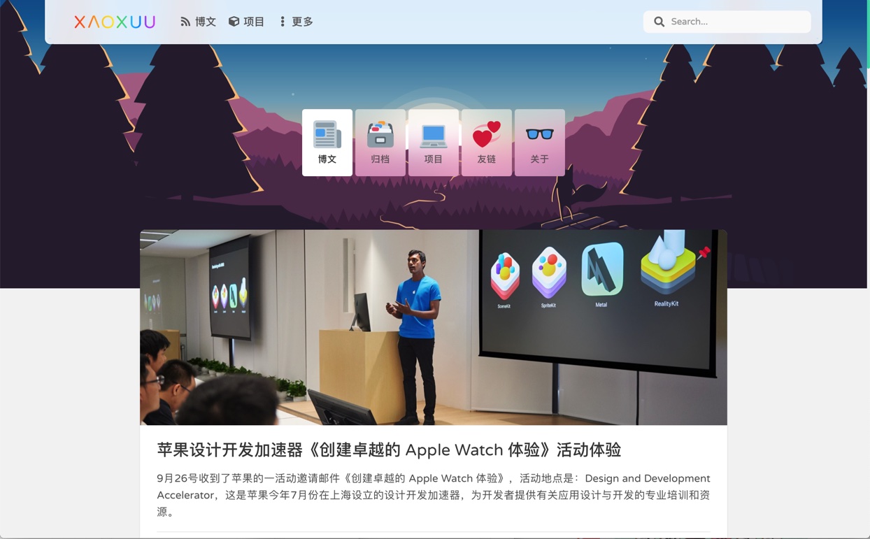
{% banner 随记 bg:https://res.xaox.cc/gh/cdn-x/xaoxuu@main/posts/20250706164631268.webp %}
{% navbar active:/notes/ [随记](/notes/) [收藏](/bookmark/) %}
{% endbanner %}

用于用户个人资料页

写法如下:
{% banner 某某 这是个人简介 avatar:https://res.xaox.cc/gh/cdn-x/xaoxuu@main/avatar/classic.webp bg:https://res.xaox.cc/gh/cdn-x/xaoxuu@main/posts/20250706163949681.webp %}
{% endbanner %}

用作文章摘要卡片

设置 link 可以让整个卡片响应点击事件,实现点击跳转到对应文章:

{% banner 博客进阶:自动化部署 本文讲了如何利用脚本和 GitHub Actions 简化博客搭建和部署流程,提高效率。 bg:https://res.xaox.cc/gh/cdn-x/xaoxuu@main/posts/20250706160404696.webp link:/blog/20221126/ %}
{% endbanner %}

Timeline

最后更新于 6.8.0 版本

时间线

支持静态和动态时间线数据源:

  • 静态数据
  • github issues 支持多种筛选参数,详见 API
  • github releases 支持多种筛选参数,详见 API
  • gitea issues 支持多种筛选参数,详见 API
  • gitea releases 支持多种筛选参数,详见 API
  • memos
  • ...

常见的使用场景请看这篇文章:

静态时间线

静态数据是写死在 md 源文件中的,在 deploy 时就已经确定了。

2021 年 2 月 16 日

主要部分功能已经开发的差不多了。

2021 年 2 月 11 日

今天除夕,也是生日,一个人在外地过年+过生日,熬夜开发新主题,尽量在假期结束前放出公测版。

写法如下
{% Timeline %}
<!-- node 2021 年 2 月 16 日 -->
主要部分功能已经开发的差不多了。
{% Image https://res.xaox.cc/gh/cdn-x/wiki@main/stellar/photos/hello@1x.png width:300px ratio:1179/390 %}
<!-- node 2021 年 2 月 11 日 -->
今天除夕,也是生日,一个人在外地过年+过生日,熬夜开发新主题,尽量在假期结束前放出公测版。
{% endTimeline %}

动态时间线

动态数据是从 GitHub Issues 中拉取的,使用方法为:

  1. 建一个仓库
  2. 创建一个 issue 并添加一个 label 进行测试
  3. Timeline 标签时加上 api:https://api.github.com/repos/your-name/your-repo/issues

例如:

_posts/xxx.md
{% Timeline api:https://api.github.com/repos/xaoxuu/blog-timeline/issues?direction=asc&per_page=3 %}{% endtimeline %}

效果如下:

示例

  1. fork shaoyaoqian/WeiboSpider 的爬虫,修改自己的仓库名
  2. 修改 .github/workflows/main.yml 中的微博ID为你想爬取的ID,修改完后每天会自动爬取你的微博,存储为 json 文件,输出文件在 output 分支
_posts/xxx.md
{% Timeline limit:20 type:weibo api:你的json文件地址 %}{% endTimeline %}

静态 + 动态

用法同静态和动态单独使用时一样,例如:

{% Timeline reversed:true api:https://raw.github.xaox.cc/xaoxuu/ghapi-json-generator/refs/heads/output/v2/repos/xaoxuu/blog-timeline/issues%3Fper_page%3D5/data.json %}
<!-- node 这条内容为静态数据 -->
这条内容为静态数据,静态数据在 `deploy` 时就已经确定了。
{% endTimeline %}

数据筛选

只显示某个人的数据

筛选最近3条todo

筛选评论最多的3条建议

上述示例代码如下:

{% folders %}
<!-- 只显示某个人的数据 -->
{% Timeline user:xaoxuu api:https://api.github.xaox.cc/repos/volantis-x/hexo-theme-volantis/issues %}{% endTimeline %}
<!-- 筛选最近3条todo -->
{% Timeline api:https://api.github.xaox.cc/repos/xaoxuu/hexo-theme-stellar/issues?labels=todo&per_page=3 %}{% endTimeline %}
<!-- 筛选评论最多的3条建议 -->
{% Timeline api:https://api.github.xaox.cc/repos/volantis-x/hexo-theme-volantis/issues?labels=feature-request&per_page=3&sort=comments %}{% endTimeline %}
{% endfolders %}

更多用法详见:

albums

最后更新于 6.8.0 版本

专辑

配置数据源:

blog/source/_data/links/分组名.yml
- title: 标题
url: https://
cover:

文章中插入方式:

blog/source/_posts/xxx.md
{% albums 分组名 %}

posters

最后更新于 6.8.0 版本

海报

配置数据源:

blog/source/_data/links/分组名.yml
- title: 标题
url: https://
cover:

文章中插入方式:

blog/source/_posts/xxx.md
{% posters 分组名 %}

md

最后更新于 5.0 版本

在局部渲染外部md文件。

示例写法
{% md https://gcore.jsdelivr.net/gh/volantis-x/hexo-theme-volantis/README.md %}
md

site

最后更新于 6.2.0 版本

网站卡片标签

网站卡片可以显示网站截图、logo、标题、描述,使用方法和 友链标签 一模一样,唯一的区别是数据文件名称为 sites.yml,可以和友链数据混用,通过分组过滤实现不一样的效果。

{% sites [筛选方式]:[组名] %}

演示效果

上述示例的源码

example
{% sites only:community_team %}

可以支持的参数

数据按组筛选

支持分组(白名单模式和黑名单模式)显示:

// 显示 communtiy_team
{% sites only:communtiy_team %}

// 除了 communtiy_team 别的都显示
{% sites not:community_team %}

// 多个分组使用 `,` 分隔
{% sites only:communtiy_team, communtiy_builder %}

friends

最后更新于 6.2.0 版本

友链标签

您可以在任何位置插入友链,支持静态数据和动态数据,静态数据需要写在数据文件中:

blog/source/_data/friends.yml
volantis_developer:
title:
description:
items:
- title: xaoxuu
url: https://github.com/xaoxuu
avatar: https://avatars.githubusercontent.com/u/16400144?s=60&v=4
- title: MHuiG
url: https://github.com/MHuiG
avatar: https://avatars.githubusercontent.com/u/38281581?s=60&v=4
- title: inkss
url: https://github.com/inkss
avatar: https://avatars.githubusercontent.com/u/31947043?s=60&v=4
- title: Colsrch
url: https://github.com/Colsrch
avatar: https://avatars.githubusercontent.com/u/58458181?s=60&v=4
- title: Drew233
url: https://github.com/Drew233
avatar: https://avatars.githubusercontent.com/u/47592224?s=60&v=4
- title: Linhk1606
url: https://github.com/Linhk1606
avatar: https://avatars.githubusercontent.com/u/50829219?s=60&v=4
- title: W4J1e
url: https://github.com/W4J1e
avatar: https://avatars.githubusercontent.com/u/74824162?s=60&v=4


community_builder:
title:
description:
items:
- title: xaoxuu
url: https://github.com/xaoxuu
avatar: https://avatars.githubusercontent.com/u/16400144?s=60&v=4
- title: MHuiG
url: https://github.com/MHuiG
avatar: https://avatars.githubusercontent.com/u/38281581?s=60&v=4
- title: Colsrch
url: https://github.com/Colsrch
avatar: https://avatars.githubusercontent.com/u/58458181?s=60&v=4
- title: penndu
url: https://github.com/penndu
avatar: https://avatars.githubusercontent.com/u/46226528?s=60&v=4
- title: heson525
url: https://github.com/heson525
avatar: https://avatars.githubusercontent.com/u/32234343?s=60&v=4
- title: W4J1e
url: https://github.com/W4J1e
avatar: https://avatars.githubusercontent.com/u/74824162?s=60&v=4
- title: luosiwei-cmd
url: https://github.com/luosiwei-cmd
avatar: https://avatars.githubusercontent.com/u/61175380?s=60&v=4

标题和描述都支持 md 格式,需要写在引号中。如果指定了 apirepo 字段,则从 issues 中取第一个 json 代码块数据作为友链。

写法如下
{% friends %}

数据按组筛选

友链支持分组(白名单模式和黑名单模式)显示:

// 显示 volantis_developer
{% friends only:volantis_developer %}

// 显示 volantis_developer 和 community_builder
{% friends only:volantis_developer,community_builder %}

// 除了 community_builder 别的都显示
{% friends not:community_builder %}
friends only:volantis_developer

实现动态友链

可以加载来自 issues 的友链数据,除了需要在 _data/friends.yml 中指定 apirepo 外,还需要做一下几件事:

xaoxuu/friends 作为模板克隆或者 fork 仓库,然后提交一个 issue 进行测试,不出意外的话,仓库中已经配置好了 issue 模板,只需要在模板中指定的位置填写信息就可以了。

提交完 issue 一分钟左右,如果仓库中出现了 output 分支提交,可以点击查看一下文件内容是否已经包含了刚刚提交的 issue 中的数据,如果包含,那么再次回到前端页面刷新就可以看到来自 issue 的友链数据了。

关于自建 Vercel API 如果您想使用自己的 api,请把您刚创建的仓库导入到 Vercel 项目,详见 小冰博客 的教程。

特别感谢小冰博客通过 Vercel 进行加速的方案,解决了原本直接请求 GitHub API 速度过慢的问题。

只显示动态数据

如果您不想创建 friends.yml 来设置任何静态数据,可以在标签中设置 api 来只显示动态数据:

{% friends api:https://raw.githubusercontent.com/volantis-x/examples/output/v2/data.json %}

友链+文章

动态友链支持显示每个友链最新的N篇文章,并按文章更新顺序给友链排序,只需要增加 posts:true 参数:

{% friends posts:true api:https://raw.githubusercontent.com/volantis-x/friends-example/output/v2/data.json %}

评论